Lens
From founder vision to market-ready story, brand, and product experience.
Role
Client
Services
Overview
Lens had a powerful technical product, but the story was difficult to understand quickly. The challenge was not simply to design a website or logo. It was to help clarify the company’s narrative, position the product, and create a system that could support sales, investor conversations, conference marketing, and product trust.
The Challenge
Lens was building in a highly technical category where speed, accuracy, trust, and credibility all mattered. The product had strong potential, but the messaging, identity, and digital experience needed to work together as one system.
The work needed to answer:
- What does Lens do?
- Why should technical buyers care?
- How do we make the product feel credible and differentiated?
- How do we turn complex value into something people can understand quickly?

Translating a complex technical category into something buyers can understand quickly.
The Insight
Through founder conversations, competitive review, and market positioning work, a core tension became clear: teams wanted to move faster without sacrificing confidence.
That idea became the foundation for the brand, messaging, microsite, video narrative, and ACE product experience.
The opportunity was not just to make Lens look better. It was to make the company easier to understand, trust, and act on.
Competitive and positioning review used to find where Lens could stand apart.
Designing the System
The work evolved into a connected system across brand, product, storytelling, and conversion.
- Brand identity and visual system
- Product positioning and messaging
- Microsite design and launch support
- ACE product identity and ROI calculator
- Sales and investor storytelling
- Video narrative and creative direction

Product and technical foundation.

How the product creates value.

A clear, connected product solution.
Creating a Clearer Market Story
The brand needed to feel technical, precise, and credible without becoming cold or generic. The visual direction was built to support trust while giving Lens a distinct presence in a crowded market.

A visual system designed to feel precise, technical, and trustworthy.

Identity work that could scale across product, web, sales, and conference materials.

A brand direction built for both engineering credibility and investor clarity.
A Visual Language Rooted in Speed
As the system took shape, one idea kept surfacing in every direction I explored: speed. It was the quality Lens delivered to its customers, and it became the lens through which I evaluated every design decision. That instinct eventually resolved into a single visual anchor — the lightning bolt. What began as a graphic device became a conceptual foundation for the entire system, standing in for acceleration, momentum, clarity, precision, and decisive action. These were not arbitrary aesthetic choices. They were a direct translation of the value Lens was bringing to the market.
From Symbol to System
A symbol only becomes a system when it shows up everywhere without ever feeling repetitive. Rather than confining the bolt to a single logo, I carried its energy deliberately across the ecosystem — the Lens and ACE logos, button treatments, microsite elements, motion graphics, video direction, and supporting brand graphics. The intent was a connected visual language in which every component felt related by a shared idea rather than a copied shape. Even the call-to-action buttons participate: a bolt-like streak of light wraps around each one, reinforcing movement and forward progress while quietly tying interaction design back to the broader brand narrative. The sharp, angular geometry inside both logos came from the same exploration, with edges that read as arrows to suggest direction — a visual argument that customers could move faster while staying confident and in control.
The Geometry of a Lens
A second direction emerged in parallel, built on polygonal forms. It drew partly on references the founder shared, including the quiet confidence of the Etched identity, and resolved into geometry that felt both technical and approachable — a system that could scale cleanly across brand, product, web, and video. Then something unexpected happened: those polygons began to evoke the clean glass slide laid over a specimen beneath a microscope. A literal lens. Given the company’s name, the coincidence felt earned. The visual language was now doing two jobs at once, signaling the technical depth of the product while reinforcing the very concept embedded in the brand.
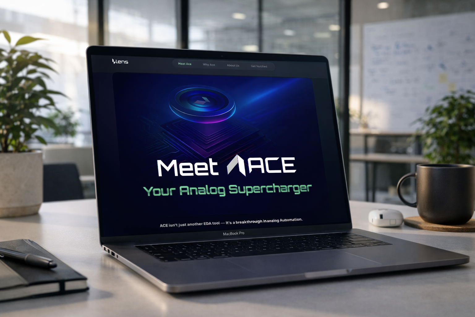
Meet ACE: The Language, Realized
The “Meet ACE” visual is best understood not as a standalone marketing asset but as the culmination of everything the system had been building toward. Its space-like environment, lens-inspired graphics, lighting, and dimensional treatment bring together the recurring themes of insight, clarity, intelligence, speed, and precision in one place. It is where the language stops being a set of rules and starts feeling like a point of view. Taken together, none of these were isolated decisions. They were connected ones — spanning identity, product, storytelling, interaction design, marketing, motion, and ultimately customer perception. The work was never about producing assets. It was about creating a coherent language that could carry Lens as it grew.
Designing for Business Impact
One of the most important parts of the work was the ACE ROI calculator. The calculator was not just a marketing feature. It was a productized way to help prospects understand value, model savings, and see the business case more clearly.
The ACE calculator helped translate abstract product value into a more concrete business conversation. Instead of asking prospects to imagine the impact, the experience helped them see potential savings, recovered time, and operational value.

The ACE ROI calculator: a productized way to turn value into a business case.
Working Alongside the Founder
This work required close collaboration with the founder to translate technical depth into a clearer market-facing narrative. The goal was to preserve the intelligence of the product while making the company easier to understand, present, and trust.
This is the type of work I enjoy most: shaping the product, story, and experience together rather than treating design as a surface layer.
The Outcome
The final system gave Lens a stronger foundation for customer conversations, investor storytelling, conference presence, and product communication.
It helped bring together:
- a clearer story
- a more confident brand presence
- a stronger digital experience
- a product-led conversion tool
- a more cohesive way to explain value
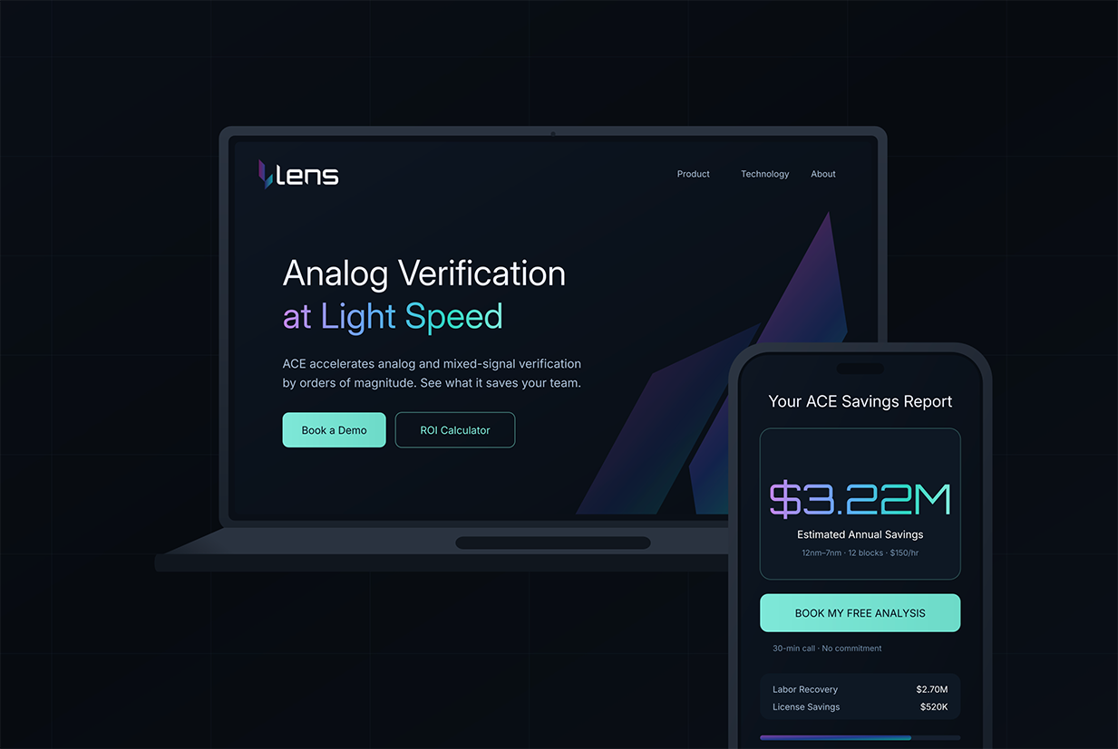
The microsite and ecosystem: a cohesive way to explain value and drive conversations.
Reflection
Lens was not just a branding project. It was a systems design challenge: connecting product value, founder vision, market positioning, and customer understanding into one coherent experience.
This work reflects the kind of role I like to play: helping teams make sense of complexity and turn it into something clear, useful, and trusted.