Note: Due to HIPAA compliance, most live product screens from this application cannot be shared, as they contain real patient data. Illustrative mockups are used in their place throughout this case study.
Stanford Health Care
Turning operating-room data into coordinated action
Role
Lead Product Designer / UX Consultant
Company
Stanford Health Care
Services
Research · Product Strategy · UX Design · Data Visualization

01 — Every empty minute had consequences
An operating room is one of the most valuable resources in a hospital. But using that resource well depends on hundreds of connected decisions: which rooms are available, which departments have access to them, how many procedures can realistically be completed, whether first cases are beginning on time, whether a department is falling behind its target, whether staff and room capacity can actually support the plan.
Stanford had access to enormous amounts of operational data. The problem was never a lack of information. The problem was turning that information into coordinated action.
Executives, operating-room managers, department leaders, nurses, and surgeons were all participating in the same system. They just weren’t experiencing the same version of it.


02 — The challenge: one hospital, multiple versions of reality
An executive thought in annual targets, revenue, and performance across the hospital. An operating-room manager thought in rooms, schedules, staffing, and daily constraints. A department leader thought in block allocations, monthly goals, and surgeon performance. A surgeon thought in individual procedures, availability, and changes to an upcoming schedule.
Each person needed different information. But every decision affected everyone else. A target adjusted at the hospital level had to flow through sites, departments, and individual surgeons. A room-allocation change could affect staffing, case volume, department performance, and the hospital’s ability to hit its annual goal.
The experience couldn’t be designed as a collection of disconnected dashboards. It had to behave like one system.
03 — My role
I led product design and UX strategy across a suite of operating-room optimization initiatives. That meant translating hospital operations into product requirements, defining user roles and information needs, mapping personas and end-to-end workflows, designing case-volume forecasting and goal-setting tools, designing operating-room block management, exploring staffing and utilization experiences, building executive and operational dashboards, prototyping alerts and approval flows, and connecting every product decision back to a measurable hospital outcome, all in close collaboration with Stanford’s nurses, physicians, managers, and operational leaders.
This wasn’t a traditional screen-design assignment. It required understanding how an operating room functions as an interconnected operational system.
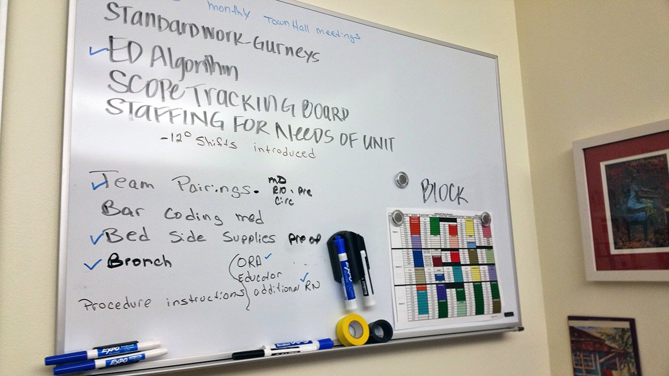
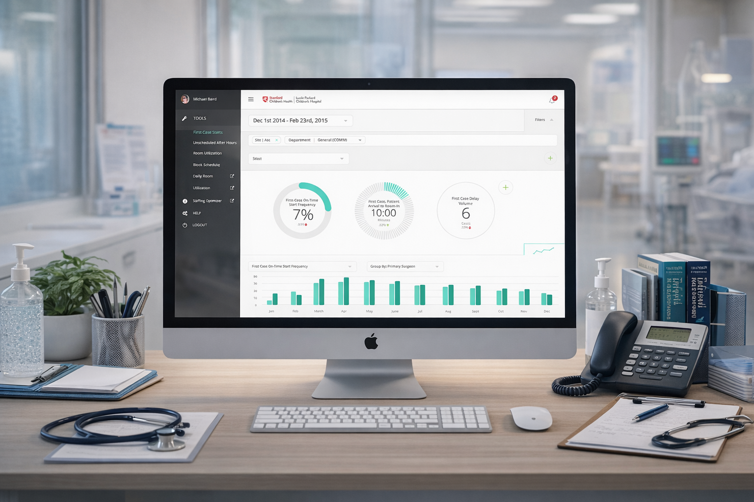
Turning fragmented operational information into one shared, interactive view of operating-room performance.
04 — Discovery: learning the system behind a surgical day
Before designing any interface, I needed to understand how decisions actually moved through the hospital. I worked with clinicians, nurses, department managers, and operational leaders to trace how surgical targets were set, how operating-room time was allocated, how departments negotiated for more capacity, how performance was monitored, how delays got identified, how managers responded when targets were missed, and where information broke down or got lost along the way.
What looked like a scheduling problem was actually a coordination problem. The schedule was only the visible layer. Behind it sat goals, capacity constraints, staffing, seasonal demand, room availability, surgeon schedules, historical performance, and financial expectations, all tangled together.


05 — The core insight: the hospital didn't need another dashboard
It needed a shared operating model.
A dashboard can show what already happened. The bigger opportunity was helping people understand what’s happening now, why it’s happening, what’s likely to happen next, what action to take, and how that decision would ripple through the rest of the hospital.
That reframed the whole direction of the work. Instead of designing passive reporting screens, I designed tools that connected insight to action: set a goal, adjust an allocation, approve a request, respond to a delay, rebalance the schedule, monitor the result. The interface became part of the hospital’s actual decision-making process, not a report about it.
06 — Designing around four perspectives
I built role-based experiences for four groups. The hospital executive needed to understand performance across the organization, set realistic growth targets, and spot where attention was required. The site or OR manager needed to manage room capacity, schedules, and block allocations for their site. The department manager needed to understand department goals, distribute volume across surgeons, and respond to changes in availability or performance. The surgeon needed a focused view of assigned goals, upcoming cases, schedule changes, and personal progress.
This role-based model let us reduce complexity without hiding the relationships between decisions. Each person saw the part of the system they could actually understand and influence.

07 — Workstream one: turning annual goals into weekly action
Most hospitals grow revenue partly by increasing surgical case volume. But a higher target only matters if the hospital actually has the capacity to hit it. Case duration ranges from a short procedure to an operation lasting many hours, and available rooms, staffing, surgeon schedules, seasonal demand, and department capacity all determine what’s realistic.
The case-volume forecasting tool helped leaders build goals grounded in operational reality. An executive could start with a hospital-wide target, and the system would suggest corresponding goals down through sites, departments, individual surgeons, months, and weeks, turning one large annual objective into something actionable at every level of the organization.

Case-volume forecasting dashboard showing annual target, historical performance, projected capacity, and suggested growth
Designing the goal cascade
A hospital-wide goal couldn’t just be divided evenly. Different sites and departments had different historical performance, capacity, case duration, and growth potential, so the system needed to calculate a realistic distribution. A hospital might set a goal to grow surgical volume by 5%, and the system could recommend a 9% increase at one site and a 4% increase at another.
If a manager lowered one site’s target, the interface had to surface that the hospital-wide goal might no longer be achievable, and that other goals would need to shift in response. Users could see not just the number they were changing, but the operational consequences of changing it.

Designing for adjustment, not blind automation
The system could recommend targets, but hospital leaders still needed control. An executive could accept a suggested target or override it based on knowledge the system didn’t have. A site manager could redistribute case goals between departments. A department manager could adjust individual surgeon targets. A surgeon could account for a vacation, a conference, or an unavailable week.
When a target changed, the system responded, flagging whether the new number was on track, too low, too high, beyond available capacity, or likely to affect the wider hospital goal. The objective was never to replace human judgment. It was to give human judgment better context.
From annual planning to daily visibility
The executive dashboard translated long-term objectives into immediate questions: how many days remain in the year, how many cases remain to reach the target, which site is ahead, which department is behind, where intervention is actually required. Leaders could move between yearly, monthly, and weekly views, starting at the hospital level and drilling down to a department or surgeon without losing context along the way.
Instead of a wall of metrics, the dashboard focused attention on the gap between current performance and the desired outcome.

08 — Workstream two: making operating-room time visible
Setting a case-volume target only mattered if operating-room capacity could actually support it. The block-management tool helped managers create, allocate, and modify room schedules, where a block represented a period of OR time assigned to a department or surgeon.
Managers needed to create recurring allocations, make one-time special assignments, divide an existing block, reassign time between departments, edit allocations within a date range, review requests for additional time, approve or deny or partially approve those requests, and communicate changes to affected teams. The experience needed to support complex scheduling without feeling like a complex scheduling system.

Direct manipulation
Rather than a long form, the scheduling interaction mirrored how managers actually thought about room time: choose a room, select a day, drag across the required time, assign the block to a department or surgeon, set whether it should repeat, save. That turned a dense administrative task into a direct visual interaction, letting managers see the schedule while modifying it, instead of having to hold the impact of a change in their head.
Requests and approvals
Surgeons and departments also needed a way to request additional operating-room time. A department leader could select an available period and submit a request, which appeared directly within the schedule as pending. The OR manager could then review it in context and approve, deny, or partially approve it, seeing both the visual location of the request and a running list of outstanding decisions, rather than treating requests as isolated messages or emails.

09 — Workstream three: designing signal, not noise
Hospital leaders didn’t want another application demanding constant attention. They wanted the system to work quietly in the background and surface information only when action was actually required. That became a core design principle: every alert had to earn attention.
Notifications were built around meaningful changes, a department missing its target, a surgeon changing an upcoming schedule, a room-allocation request needing approval, a target adjustment putting the wider hospital goal at risk, performance falling past an established threshold, the system redistributing future cases to compensate for a missed goal. An alert could take the user directly to the affected goal, schedule, department, or block. High signal, low noise.
10 — Creating a connected operating system
The work ultimately connected first-case start performance, room utilization, case-volume forecasting, block scheduling, unscheduled and after-hours activity, daily room-time visibility, staffing optimization, year-over-year comparisons, goal setting, notifications, requests and approvals, and executive reporting into one thing. Each tool solved a specific operational problem. Together, they helped Stanford see the operating room as one connected system instead of a dozen disconnected ones.

All connected Stanford OR optimization tools needed a central operating-room data platform
11 — Workstream four: improving the first case of the day
One of the most important operating-room performance measures was the first-case on-time start. A delayed first procedure created a chain reaction: the room fell behind schedule, later cases got pushed back, staffing became less predictable, patients and families waited longer, and the delay could ripple through the rest of the day.
But first-case performance was never controlled by one person. It depended on coordination across nurses, physicians, patients, rooms, equipment, and preparation, which made it as much a service-design problem as a scheduling one.

Journey map of the first surgical case of the day, showing the people, preparation steps, dependencies, and possible delay points
The Go Sticker: a small intervention with measurable impact
The Go Sticker initiative focused on improving first-case on-time starts through a lightweight operational intervention, rather than another complex digital workflow. It worked within the existing hospital environment, with a simple objective: create a clearer shared signal around readiness and help the team move the first procedure toward an on-time start.
Evaluated against actual operating-room performance, first-case on-time starts increased from 36.7% to 52.7%, a 16 percentage-point improvement. Across 1,824 cases, the initiative saved 55.63 operating-room hours, an estimated $121,834.52 in savings over three months, or roughly $487,338.08 annualized.
That result reinforced something I still carry into every project: not every high-impact solution needs to become a large software feature. Sometimes the right intervention is the smallest change capable of moving the whole system.

12 — Testing the system
Complex workflows like these couldn’t be validated through visual review alone. The prototypes had to answer real operational questions, whether an executive could understand how an annual target was distributed, whether a manager could adjust a department goal without losing the hospital-wide context, whether an OR manager could create a recurring allocation efficiently, whether a surgeon could request additional time without misreading availability, whether a manager could identify why the hospital was falling behind, whether alerts could direct attention without becoming another source of noise.
Interactive prototypes let stakeholders experience the future workflow before engineering committed to building it, and gave design, operations, clinical staff, and product a shared language to work from.

13 — Design principles
A few principles guided the work throughout:
- Show the consequence of every decision
- Design for the user’s level of responsibility
- Make the system proactive
- Keep people in control
- Reduce interaction wherever possible
- Use the lightest effective intervention

Stanford design principles
14 — Outcomes
The broader operating-room optimization work contributed to approximately $1.2 million in increased revenue during the first year.
The Go Sticker first-case initiative alone produced:
First-case on-time starts improved from 36.7% to 52.7%
55.63 hours of operating-room time saved across 1,824 cases
$121,834.52 in estimated savings over three months
$487,338.08 in estimated annualized savings
Beyond the numbers, the work gave hospital leaders a clearer way to connect strategy to daily operations. Annual goals became weekly actions. Operational data became decisions. Schedule changes became visible across teams. And a genuinely complex set of hospital workflows became something people could actually understand and manage.

15 — What this project demonstrates
Stanford is proof I can work inside a complex, high-stakes environment where product decisions affect people, operations, and financial performance all at once. It asked me to understand a specialized operational domain, collaborate with clinical and executive stakeholders, translate real complexity into clear product models, design for multiple roles and levels of responsibility, connect data visualization to meaningful action, balance automation with human judgment, design both digital products and service-level interventions, and measure design success through operational and business outcomes, not aesthetics.
The success of the work never came from making the data more beautiful. It came from making the system more understandable.
16 — Reflection: from data to shared understanding
Healthcare systems contain extraordinary complexity. But complexity inside the organization shouldn’t have to become complexity inside the experience.
This project taught me that design’s job isn’t simply to simplify the screen. It’s to reveal how the system actually works, to show relationships, to make consequences visible, and to help people at different levels of an organization act from the same understanding.
Stanford already had the data. The opportunity was turning that data into alignment, and alignment into action.